Author Archive

We’re updating SiteBuilder!

September 3, 2009

We conduct frequent user tests and review your feedback from the blog and our customer support center to plan our development, and we take it all into account (drop-down menus anyone? we hear you). We can’t talk about all that we’re planning, but we’re happy to announce that we’ve just finished an exciting update to our award-winning SiteBuilder website-building tool. Here’s product designer Jerry to tell you all about it –  Phil, Editor

We’re always trying to find ways to make it easier for you to build and maintain your websites, so based on your feedback we’re making some changes to SiteBuilder that we think will make it more efficient to use.
SiteBuilder website creating software - a new look

Visual Redesign

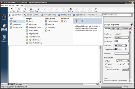
The first change is visual: when the update is made in the next few days, you’ll see that we’ve updated the icons in the toolbar at the top of SiteBuilder; same function, easier to identify icons. We’ve also refreshed the look of the element menus and shortcuts too, but that’s just the start for those…

Updated Shortcuts

SiteBuilder used to have four element shortcuts: Text, Image, Rectangle, and Site Navigation. By looking at which elements were used most frequently, we identified several that really should have a shortcut. So here’s the new list of element shortcuts: Text, Image, Photo Gallery, Media File, HTML, Rectangle, and PayPal Button.

SiteBuilder website creating software - element shortcuts

If you want some extra screen space to work on your website, you can hide and show the shortcut bar by clicking the arrow button.

To make room for this expanded list, we removed the shortcut for Site Navigation. Why? Because most people create their websites using one of our design gallery’s templates with a site navigation already built in. Of course, if you’re starting your site from scratch or need to add another site navigation menu to your site (for example, to create a footer of links), you can still find that element in SiteBuilder’s element category menu. Only now you’ll look for it in the new Design & Links category…

New Element Categories

One key thing we’re doing is reorganizing SiteBuilder’s website-building elements into new, more useful categories. As we developed new elements over time, our old categorization got outdated, with too many main categories and none with labels. We wanted to regroup elements in a more efficient way that would be easier to use.

The new menu organizes all elements in five main categories, each of which has more specific subcategories to make elements easier to find:

  • Content – Here’s where you’ll find elements for adding text, images, media content (like audio and video), and custom HTML to your site; everything you use to talk about your business in your own words, sounds, and images.
  • Design & Links – These elements create the structure of your site, including navigational structure and the overall visual design of your site.
  • Communication – This category has elements that let you interact with your customers, either through social media channels like your social networking site pages or a feed to your blog, or directly through email and chat. This category also has form elements that let you collect feedback and information from your customers.
  • Information – This category holds elements for information display like your location, time and date, and the weather.
  • E-Commerce – Anything related to selling through your website can be found here, like PayPal buttons and shopping carts, the SimpleStore add-on, and, if you have an e-commerce package, your Storefront.

Personal Elements

The five main categories hold elements that are best suited for building a professional-looking business website. The remaining elements have been given their own category called Personal Elements, because they’re often used on personal websites. If you want to access those elements, just select View > Show Personal Elements.

We know that there’ll be some adjustment for those of you who know the existing menus like the back of your hand, but we really believe that you’ll find the new categories make better sense and will be easier to learn and use.

Descriptions

Another goal of the redesign was to make it easier to understand what each element does without having to consult a help menu. In the new SiteBuilder, when you mouse over an element in the shortcuts bar or in the main menus, you’ll get a description of the element and some notes about how best to use it. If you want more detail you can always go to the Help tab (the one with the question mark on it) in the element’s properties editor, but now we’re putting the basics front and center so you can build more intuitively, and more quickly.

New Element

We’re also adding a new element called “Social Networking” to help you take advantage of the power of social networking sites to help you grow your business; we’ll be covering that in another post in a couple of days.

That’s it for now! We hope this refresh of SiteBuilder will make it even easier for you to build a great-looking website. We’ve scheduled the update for the next week, so stay tuned, and let us know what you think!
Add a new page to your website’s navigation menu–it’s easy

April 30, 2009

We just streamlined the process you can use when adding a new page to your website with SiteBuilder.  Now it’s  easier to add a link in your site navigation menu to your new page. Here’s Jerry to tell you about it – Rochelle.

When you start working on creating a website, you need to decide what links to include in your site’s navigation menu. It’s important to give your site visitors an easy way to access key pages on your site with a single click, but, if you have a lot of pages, you don’t want to clutter up your navigation menu with a link to every one of them.

We’ve made it a little easier to make that decision right when you add a new page to your website.  Now when you add a new page with SiteBuilder, you’ll see a new option that makes it a simple matter to either add a link in your site navigation to your new page, or remove it. You can always add or remove a link to your new page later by editing the navigation element, but the new option makes it more convenient.

Here’s how it works. To begin, add a new page in any one of the usual ways:

1) Click the New Page button in the toolbar

2) Select File, then New Page from the menu

3) Right-click and select New Page from the File Manager

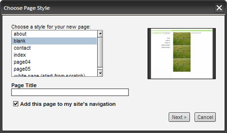
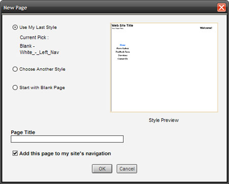
You’ll get the familiar page template selector. It looks like this if you’re using a design from our Design Gallery:

Adding a new page to your website with SiteBuilder

Or like this if you’re using a design from SiteBuilder:

Adding a new page to your website with SiteBuilder designs

Here’s where the new option comes in.  To add your new page to your navigation menu, make sure there is a checkmark in the box labeled ‘Add this page to my site’s navigation.’ By default, that checkbox is checked automatically; if you don’t want your new page to have a link in your navigation menu, just click the box to remove the checkmark. If you don’t have a navigation menu on your site, you won’t see that option at all.

Then make sure you give your new page a title. Search engines use page titles as part of their calculation for determining how prominently your site will appear in their search results.  Perhaps more importantly, your page title will appear as part of the link to your site in those results.

page-title1

When you’ve finished, just click Next.

The next step is deciding on the details of the link to your new page. Again, if you don’t have a navigation menu on your site, you won’t see this page.

new-page-nav1

Here’s how that works:

1) If your site has more than one navigation menu, choose the menu you want to use for your new link. Otherwise, the new page link will be automatically added to the only navigation menu on your site.

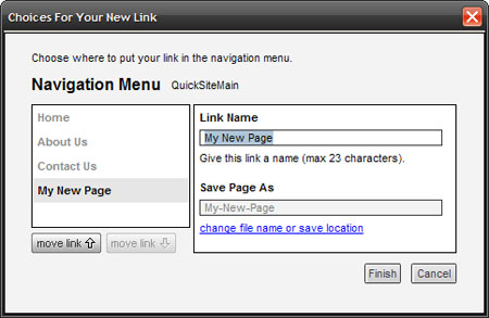
nav-menu1

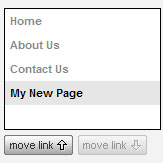
2) Next, decide where you’d like your new link to appear in your navigation menu. By default, SiteBuilder will add the new link to the end of your menu, but you can move it wherever you like in the menu by using the buttons below the list of links.

link-list1

3) Now it’s time to give your new link a name. If you gave your new page a title as I suggested, SiteBuilder will by default give the link to that page the same name.  If you prefer a different name (something shorter and more appropriate for a link, perhaps), you can change it here.

link-name1

4) To finish, you can change the name of the file for your new page, and where it will be stored. By default, SiteBuilder will use your page’s title as the page’s file name, but you can change both file name and location by clicking the change file name or save location link.

When everything looks good, just click Finish, and you’re done!

Hope this makes things easier for you.  If you have any questions about this new process, please let us know!

YouWant it, YouGot it: the new YouTube video element

November 3, 2008

If I’ve heard our members say it once I’ve heard it a thousand times: “When are you going to make it easier for me to add a YouTube video to my site?”  I really didn’t want to start on another thousand times, so… we built it!  We’ve just added a new YouTube element to SiteBuilder; here’s Jerry, the product designer responsible for it, to tell you about it — Rochelle.

You’ve probably noticed that websites now use lots of video. Services like YouTube have made it possible to add videos to a page by copying and pasting some HTML code into it. Some of you have already used SiteBuilder’s HTML Snippet element to add a video this way.  But it ain’t easy.  Adding HTML code can be kind of complicated, and frankly it isn’t the way we wanted to make you do it.

So we built you something I think you’ll like: the new YouTube element in SiteBuilder. No need for understanding or handling HTML code anymore–adding a video to your site is as easy as copying and pasting the URL of the YouTube video from your browser’s address bar.  You’ll also be able to see how the video player will fit in with the rest of your site on the SiteBuilder stage (the draft layout you see as you work on a web page in SiteBuilder).

Let’s try it out and add a video to a web page.  First, let’s drop the YouTube element onto our site by simply clicking it in the element menu under the “add images and files” element icon:

When you first drop your element on the SiteBuilder stage, it will look like this:

Now let’s find a video on YouTube to add to our page. To get there, go to www.youtube.com in your web browser, or just click the ‘YouTube’ link in the Properties Editor.  Let’s add my favorite video of the Internet Fairy. All we have to do is highlight or select the URL in the address bar and copy it.

You’ll find the URL you need in the address bar at the top of your screen:

We simply highlight that address from the YouTube page and copy it.  Then we go back to the page we’re building in SiteBuilder, and paste that URL into the ‘YouTube URL’ field in the properties editor in SiteBuilder.

You’ll notice that the element on the stage now shows us how the player will look on our web page.  We’ll be able to see the video itself when we’re done editing our element and we preview or publish our page.

We can control the way the video behaves, too.  There may be times when you’ll want a video to begin playing automatically as soon as a visitor gets to your page. In general, though, unless the video is the main focus of the page, you’ll probably want to let your visitors decide whether or not to watch the video. This is especially true if you have more than one video on the page. So for now we’ll leave the ‘Play Automatically’ option unchecked.

You can also choose whether or not to let YouTube suggest related videos to your visitors when they’ve finished watching your video. You’ve probably seen YouTube recommendations before; they look like this:

You get to decide if other content from YouTube would be appropriate for your purposes, or whether it would be distracting.  For now, let’s leave ‘Include Related Videos’ checked.

One of the best things about using the new YouTube element to add a video is that you can now customize the player’s appearance and see the changes directly on the stage.  For our example, let’s choose a different color for our player; how about dark blue:

Here’s how that will look:

We can also add a border of the same color to outline the player more:

And then we can preview our work; notice that the video plays right on the stage:

If we like what we see, all we have to do now is publish it:

And that’s it!  Adding a video is now just a simple copy and paste from your browser to SiteBuilder. Give it a spin; I recommend starting with Ninja Cat, one of my personal favorites: [http://www.youtube.com/watch?v=muLIPWjks_M].  Have fun!

Color me beautiful Part 2 – choosing custom colors with your visitors in mind

May 9, 2008

One of our product designers, Jerry, wrote in January about the nuts and bolts of using Homestead’s color tools. Here he is again to give you the next in his series on color: how to choose good colors for your website design – Rochelle.

Last time I talked about how to use tools like the color picker to customize your site. Now that you know how to pick colors, maybe we should talk a little about what colors you should consider using in the first place.

There are two very important characteristics of color that you should be familiar with and keep in mind as you make decisions in the design you your websites: aesthetics and usability. Both can have a profound affect on the effectiveness of your site, and they don’t always work hand in hand.

The aesthetics of color

There are many things to consider when choosing colors for a site; your preferences, the mood you want to set and your site’s message or purpose are just a few of them. These factors are unique to you and your site, and the choices you make convey a great deal to your visitors, who respond to them in their own highly individualistic way.

Colors often have personal and cultural associations to your visitors that you should try to keep in mind. Here are a few useful generalizations about some basic colors (depending on who you are, you may disagree!):

  • Red: aggressive, passionate, vital, energetic
  • Orange: fun, cheerful, exuberant, positive
  • Yellow: light, cheerful, easy going, optimistic, warm
  • Green: tranquil, fresh, healthy, deeper green associated with wealth
  • Blue: serene, dependable, secure, faithful, associated with the sky and sea
  • Purple: sophisticated, royal, mysterious, blend of passionate red and serene blue

Successfully choosing colors along aesthetic lines is a lot easier if you have an idea who your audience is and what you want to convey to them.

Beyond the more intangible aspects of color selection, there are also a few practical things to pay attention to, since your color choices also have a big impact on how easy your site is to use.

The usability of color – contrast and readability

It’s important to make sure the text on your site is readable. That means not only using the right font and text size, but also making sure there’s enough contrast between your site’s text and the background behind it. Black and white contrast nicely, but if you to use a different background or text color, things get a little trickier.

We’ve all been to websites that seemed a little color-happy; think about how you reacted to those, and whether you had trouble reading any of the text on them. Remember, it’s not enough to have your site look pretty; it needs to convey your message properly and easily too.

As a general rule, a color contrasts the most with the color on the opposite side of the color wheel, and brighter colors stand out against a darker background. You can find contrasting colors by looking at the color circle of the Color Picker, which is basically a color wheel.

building a website with color

Just keep in mind that some colors will have great contrast to each other but look ugly together. However, you can generally find contrasting colors that look good together. The best sanity check is to find a few people to look at your site and give feedback on how easy your content is to read and how good it looks.

Highlighting

Color contrast can also be used to highlight, which can be very useful when you need your users to see something specific on your site. Whatever it is you want to draw attention to should look different from everything else. The trick is to keep the “everything else” consistent throughout your site so your intended highlights pop out.

Here’s a rough guideline: use a small number of colors (four or fewer) that complement each other for each of your pages. Then have one or two highlight colors. Trying to use too many colors makes nothing stand out, since visitors perceive a difference wherever they look on your page!

Be very critical about deciding what the really important things are on your pages. You don’t always need to use color contrast to draw attention; sometimes, good layout will lead your site’s visitors to where you want them to go. Color isn’t your only tool in good design.

Colorblindness

Colorblindness should be a special consideration. About 10% of males have some form of colorblindness, the most common being some form of red-green colorblindness (blue-yellow and achromatic colorblindness are rarer). For these people, colors close to red and green appear to have much less contrast than they do to those with full color vision, so red-green combinations should be avoided where contrast is important.

An advanced class in usability

For those who want (a lot) more detail about the usability concerns related to color, NASA’s Ames Research Center has a site on color usage in critical applications such as flight. They emphasize usability and don’t really consider aesthetics. They don’t care if it’s pretty – after all, they’re designing color schemes for pilots and others who need to process data very quickly. But it can be useful reading if you’re interested.

The grain of salt

While aesthetics and usability don’t necessarily conflict (and often don’t), leaning more towards one sometimes means making compromises to the other. When making these tradeoffs, it really comes down to deciding which direction benefits your site’s message and your visitors more, as long as the tradeoff isn’t too extreme. Usually though, there is a way to accommodate both aesthetics and usability.

Things can get a little complicated with color, but if you keep the needs of your site and your visitors in mind you should have no trouble finding a good balance. If you have any specific questions, write in with your comments and I’ll try to answer them.